Last Updated on October 24, 2017
Whether you run a digital marketing firm or you own a blog, Google algorithm updates affect you equally. Speaking of the recent updates the Mobile-First index is the next expected update that will affect the SEPRs in the search giant.
Don’t Panic!
Unlike Panda and Penguin updates, any major reshuffle in the rankings is not expected from the Mobile-First update. Surely, you need not to panic, but understand what is this update is about and how you can make your site compatible with Mobile-First with a few tweaks. We have dedicated this post entirely to make you understand the Mobile-First indexing and how you can prepare your website to keep your rankings unaffected in Google.
Mobile-First Indexing-What it is all about
Before we start with the update, you need to understand how Google indexes website pages. Among several factors that result your ranking in the SERPs, one important element is the user experience and friendliness of your website design.
At present Google crawls the websites from the perspective of a desktop user. In simple words, how user friendly is the design of a site is on a desktop platform contributes to its ranking. But, with the advent of the smart phones and easy availability has drastically changed the dynamics of internet users. Now the number of mobile users has overtaken the number of desktop users and this has forced Google to pay attention to Mobile-First indexing rather than desktop-first.
According to StatCounter, in 2016 for the first time “ Mobile and tablet internet usage exceeds desktop for first time worldwide.” And from there on this trend shows no sign of slowing down as we can see: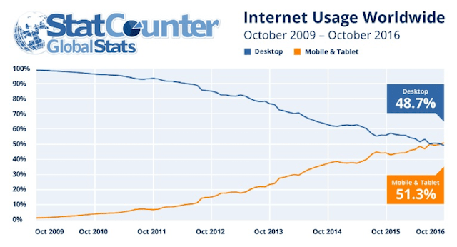
As we know Google always keeps the relevancy of its search results for the target audience on top, it made it official that soon the Mobile-First indexing will be primary algorithm to calculate SERPs ranking. Important point to note here is, at present the kind of content you deliver on the mobile for your website does not affect the ranking of your desktop pages in the search results but once this update is fully implemented, your mobile content will become the primary source of ranking evaluation.
In its official statement, Google states that-
“To make our results more useful, we’ve begun experiments to make our index mobile-first. Although our search index will continue to be a single index of websites and apps, our algorithms will eventually primarily use the mobile version of a site’s content to rank pages from that site, to understand structured data, and to show snippets from those pages in our results.”
Once Google switches to Mobile-First indexing, it will crawl the websites from the mobile users’ point of view i.e. websites will be ranked based on their mobile versions and not desktop versions.
Do you need any special tool and techniques to get ready for mobile-first index?
At the recent SMX Advanced conference, Gary Illyes (from Google) stated that the update is many quarters away, which means it won’t be implemented before 2018.
You can stop panicking now as you have enough time to prepare for the Mobile-First index update. Other than that many of you may not even need to update anything as most of the website designs are already optimized for mobile platforms.
For those of you who don’t have a mobile friendly website design yet, it is not a bad day either. Google has made it clear that it will most certainly launch the “quality-neutral” update, which means although your rankings will be affected if your website is not mobile friendly by the time the update happens, but like other updates you won’t disappear from the search results.
Your desktop website will continue to be indexed based on mobile view. Any user who searches your website will still be able to find you on Google.
Now comes the real question, DO YOU NEED TO ANYTHING SPECIAL?
Most probably not!
As already mentioned most websites are mobile friendly and CMS like WordPress already are designed to be mobile user friendly most of the websites will see no major change in their rankings once the Mobile-First indexing rolls out.
But you need to worry if…
Till now your mobile sites are poorly structured, are hard to access or have pretty thin content as compared to their desktop versions. Such sites may be enjoying top rankings in search results due their content rich and well designed desktop versions, but once the changes happen, such mobiles will be penalized most probably.
In a nutshell, if your sites have a responsive design that offers the same user experience and quality on the desktop as well as mobile platforms, then you have nothing to worry about once Mobile-First index update rolls out.
But you if you fall in the minority section of website owners with websites that are not optimized for mobiles and tablets, you can rectify the mistakes making a few changes to avoid penalty.
Preparing for Mobile-First Index Update
Before you even continue with the following steps, make sure your website is not already mobile friendly. You can use Mobile Friendly Test from Google to check.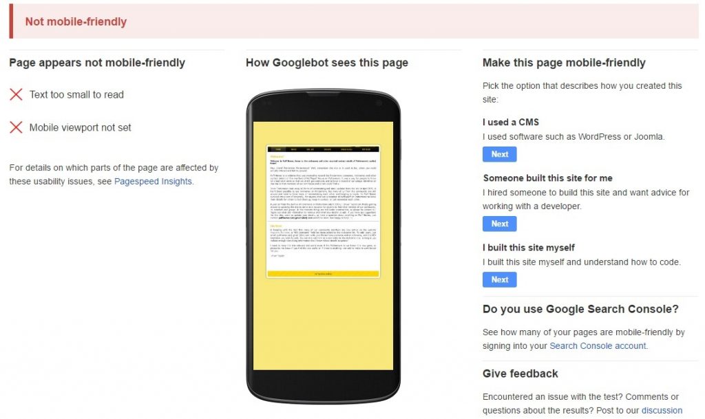
Start by restructuring your website to be mobile friendly.
Responsive design
As soon as possible switch to responsive website design. Google already has a complete guide for users to switch to responsive design. The benefit of a responsive site is that you do not have to work on making your website’s design friendly across various devices. Responsive design keeps your site consistent across all the devices. This means the HTML (content structure) remains the same, only CSS changes to make your website easy to access and navigate on mobile devices.
If you have doubts whether your website is responsive or not, quickly check on RESPONSIVE DESIGN CHECKER. It’s a free tool.
Having a responsive website is a lot easier than maintaining a separate mobile site.
Content Structure Update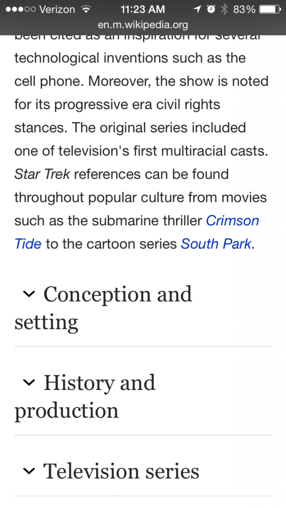
Here is a glimpse of Wikipedia’s content is structured on mobile devices. If you will notice, there is scaling back of the content but restructuring. You need to do the same if for some reason you are not able to make your website design responsive by the time the Mobile-First Index update rolls out.
Keep the content of the desktop version and the mobile version of your website the same, do not cut the content so that it can fit the mobile screens.
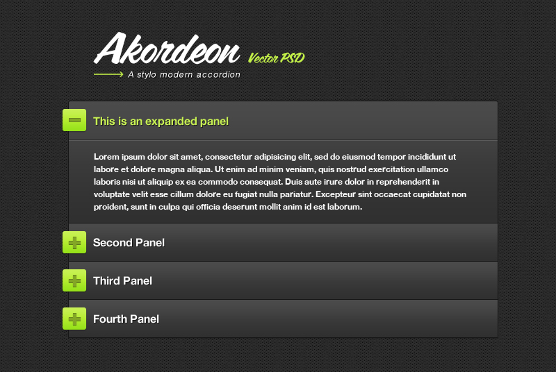
Important thing to note is Google won’t penalize you for having content in an expandable form such as accordions and tabs as such design features are critical for a mobile site.
On the other hand, if you cut the content, you also crop the important keywords to rank for and the overall quality of the content gets poor. Clearly labeled expandable content keeps mobile sites simple and easy to navigate. Google understands this basic need of mobile design.
Technical Tweaks
Just like desktop versions of websites, you need to make sure that the architecture of the mobile sites is also user friendly. Navigation of the website is the most important aspect that you need to work on this segment. All pages and sections of the mobile site should be easy to find and accessible. Internal links take more importance on mobile websites, use them wisely.
Structured data is important for organizing the content on the mobile sites as well as guiding Google to understand what the content and website is about. Most mobile sites lack the schema markup. Make sure that the mobile version of your website has proper Structured Data.
You can take help of the Google’s Structured Data Markup Helper to test your mobile pages.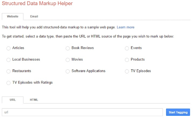
This tool will help you clear unnecessary markup and will guide you to update the structure data accordingly.
Finally, when you are through all the above steps verify your optimized mobile site with Google Search Console. Most probably you already have your desktop site verified, but verifying again will make Google index your mobile friendly web pages.
Conclusion
Google Mobile-First index update is going to switch the SERPs from desktop view perspective to mobile view oriented. However, it does not mean a whole lot of change for your websites. If you do not have a mobile friendly site already we have listed all the steps that will make your desktop mobile ready with ease.