Last Updated on August 11, 2024
The number of mobile phone users is multiplying second by second around the World. At first, Google used to decide rankings of the websites on the basis of internet users through the desktop. But in the recent past, usage of internet through the mobile phones is growing at an incredible rate of speed. Statistics say by 2016, the download of applications on the mobile phones reached 150 million across the world. Undoubtedly, the number will keep on rising but never goes down.
Though we miss out on official statistics, Brightedge state that more than half of the traffic for the websites say nearly 57 percent come from mobile phone users.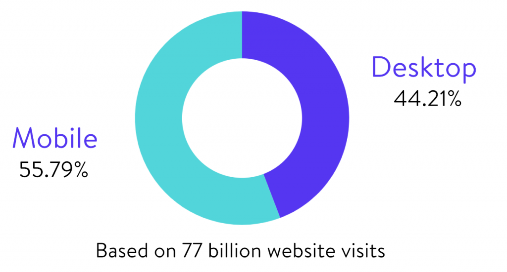
According to these statistics, you can expect a big change in your website traffic if you focus more on the mobile version of your website in addition to the desktop version. The immediate impact of the rise of website traffic on mobile phones falls on the SEO rankings of your website.
Google made an announcement regarding their pre-planned change of SEO indexing on the basis of the searches on the mobile phones. This statement astonished most of the website publishers, SEOs and developers worldwide. They were surprised about what is the impact of the Google’s new decision on their website rankings.
Google WebMaster’s blog, stated that though the search index will be as usual, they are planning to design algorithms to rank the websites based on the content of their mobile version. They use the mobile phone version of the websites to understand the structured data of the website and display the snippets on the pages in the search results.
This decision of Google will bring massive changes in your website rankings. These changes need preparation to understand the SEO strategy based on mobile indexing. The preparation for mobile indexing changes makes you precede your competitors in a progressive manner. Here are some steps to help you out for a better understanding about mobile-first indexing. For this, you have to have a basic knowledge about mobile-first indexing.
About Mobile-first indexing
Mobile-first indexing means, Google decides the rankings of your websites based on your mobile phone version of your website. For example, if you type a query, you will get a number of search engine results. Google used to rank the results based on desktop searches. But to adopt the changes according to the rise in mobile internet usage, Google started ranking the websites based on mobile internet users. The requirements for ranking a website on desktop and mobile phone differ in various aspects. To adopt the changing requirements of the users and massive growth in mobile website traffic, Google decided to change the mobile version of a website the fundamental factor to rank a website.
Mobile-first indexing does not mean Google ignores the needs of desktop users. Google wants to cater the needs of the users regardless of the device they use. The number of mobile internet users crossed the number of desktop users worldwide in the recent past. Mobile internet usage does not close all its doors for desktop users. Improving mobile-friendly features of a website makes a good opportunity for the website owners to develop a wider range of the market. 78 percent of people said that they found new means of business they never knew after searching for some queries using mobile phones. This does not mean that desktop searches do not impact the SEO of your website. Google just wants to change your perception in developing your website rankings.
For example, if the buttons of your website are smaller that is not legible in the mobile phone version, it may annoy the audience. This will impact your website rankings. You need not change the strategies of your business and SEO but have to develop a balanced outlook towards mobile and desktop versions of your website. But you should take care that you optimize your website on mobile phones before Google changes the strategies for website rankings.
Google did not give any specific date for changing their website ranking strategies but understanding mobile-first indexing at the earliest provides you the opportunity to top the search engine rankings. A representative of Google said that they have to test the possibilities of problems in mobile –first indexing before implementing it on a whole. A press release during SMX conference in March 2017 gives a clear idea about the moves taken by Google to improve their action plan based on user satisfaction. Gary Mulleus gave a clarification about the same.
The only measure you can take to avoid falling prey to mobile first indexing by Google is to prepare for the changes.
Test your mobile website
To enhance your website rankings, you have to provide the user the best browsing experience you can. For this, you have to test the mobile-friendly qualities of your website. Thanks to Google, this is an easy process.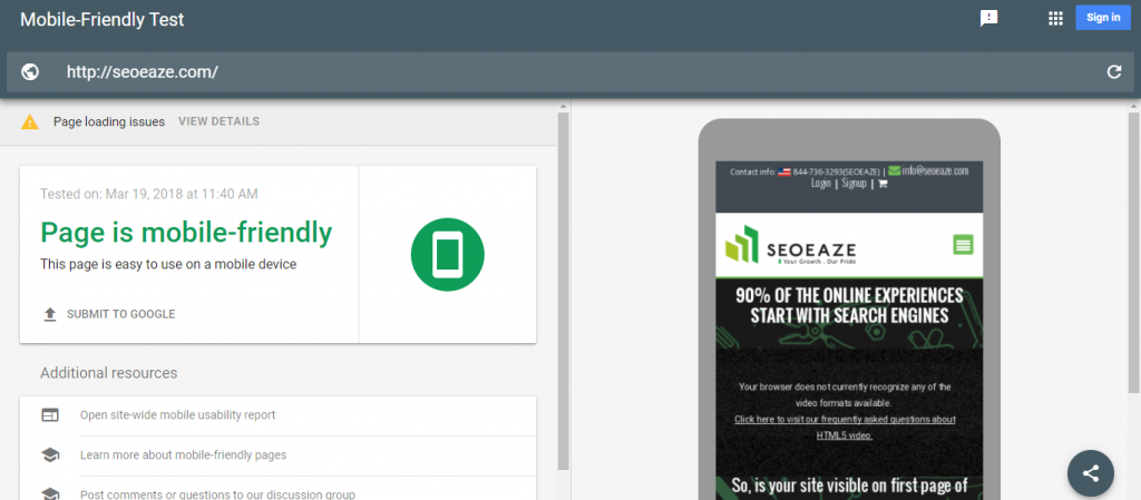
- You can use Google Mobile-Friendly test for this purpose through the link ( Link is retired now so removed from the page )
- You should simply enter the URL of your website in this link.
- Once you enter the URL and press “Run test”, you will be navigated to a page that lets you know whether your website is mobile friendly or not.
- If your page is found not mobile friendly, you can use these tips to enhance the mobile-friendly qualities of your website
- You may think you will not face such issues if your website has a desktop and mobile versions similar.
To resolve these issues, you have to optimize the content of the website keeping the needs of mobile internet users in mind. If you have optimized your website content perfectly, you have no need to worry about your website rankings. For maximum user satisfaction, you have to take care of the following aspects.
- Check for dynamic elements
Check whether you can navigate through the content of your website easily on your mobile phone.
- Check load time
Check the loading speed of your website and the time taken to navigate for each page. Check for loading time taken by each page. Your pages should load within 3 seconds or less. If it is high, try to fix it. You can take the help of GT Metrix to know the factors that make the loading of your website slower. This is just like Google mobile-friendly test that makes you know the website rankings on the basis of loading speed. You have to simply enter the URL of your website to check the rankings of your website on account of loading time.
- Know whether your website is mobile-friendly or not and mobile-responsive or not.
There is a difference between the two and you need to understand it. This guide can help you to know why mobile-friendliness is different from mobile-responsiveness. - Check whether your mobile version and desktop version of your website are exactly the same
Mobile versions seem low-quality versions for desktop versions of a website in many cases.
If mobile user experience of your website is frustrating, it may be perilous for your website SEO.
- Remove Hover elements
Get rid of hover elements that impact your website rankings. Hover elements may have a negative impact on the user experience. You cannot control the hover elements on mobile phones. So, remove them.
- Test on real devices
Keep on testing your website on real devices by checking each and every page. Keep an eye on loading time of each page and defects in navigation. You can use free testing guide for your mobile version of the website.
- No Flash
Avoid content that supports only Adobe flash player. Go for JAVA or HTML5. The reason is, some mobile phones do not support Adobe flash player.
- Avoid pop-ups
Avoid pop-ups on your mobile as they may annoy the users.
10.Avoid use of big graphics
Translation of big graphics become difficult and may take a long time to load. This may frustrate the users. So, avoid the use of big graphics and images to make your website more mobile-friendly. You can go through this tutorial for more guidelines.
The optimization of your website depends on how mobile friendly your website is in the past. The rankings of your website depend on how responsive your website is on the mobile phone. If your site is more responsive, you need to make small changes to optimize it.
You need to make the following changes in your website content if you need to optimize it dynamically on the basis of needs of the mobile users.
Check the content
Check the mobile-friendly qualities of your website content. You can reach a top place in the rankings with the help of high-quality content. You have to recheck the content, images, and videos before making it available to the viewers.
Only a website’s response time can’t enhance the rankings but plays a key part in it.
The factors you have to review to check your website content are
- Flexibility of texts and images
- Does your page have zoom capability by default?
- Size of the tap targets by default is 16px for most of the browsers.
- Whether the phone numbers on your website are tappable or not?
- Make sure your site is designed finger-friendly. The ideal design should have 44 pixels of white space around the elements.
- Implement mobile switchboard tags.
- If you are using mobile web fonts, make sure that they are loaded correctly.
- Specific design for the mobile menu
- Activation of browser caching for the convenience of the users
- Adaptability of fonts and styles
- Usage of CSS media queries to define breakpoints
- Resizing website images for speed
- Visibility of navigation features
- Use mobile-optimized version of website builder
- Detection of devices your viewers are using an automatic update
- Have you added your website to Google search console
- Checking the speed of the content loading and website response
 Decreasing HTTP requests
A decrease of HTTP requests and images enhances the speed of your website response and reduces loading time.
Impact of metadata and social metadata
Mobile version has space limitations. So make sure that your metadata structures are short in length. They need not be exactly of the same length to that of desktop versions.
Coming to social metadata, a basic review of the following factors is the minimum requirement.
- Facebook articles, photos, videos, etc
- Summaries, galleries, images, apps, video, and audio on Twitter cards
- Movies, articles, recipes, and products related to Pinterest rich pins.
- Coming to Google plus, products, books, reviews, articles, events, local business, and organizations
- For more guidance, refer this Google Authorship Guide
- Coming to Twitter cards, you can use the link https://www.searchenginepeople.com/blog/how-to-control-the-way-your-content-displays-with-twitter-cards.html
- for twitter card with a large image
- If you want to use only one type of metadata, you can use Open Graph as all platforms support this version.
Optimized back-end
To prepare your website for mobile-first indexing, you can use browser caching. You should compress the data and unnecessary backlinks or redirection links.
Use of structured data
Use of detailed structured data helps you out in enhancing the website traffic. Check whether your website supports structured markup. You can use this Google tool for this. You can enter URL of your website in this link and check for errors or warnings. Unnecessary links may impact your website rankings. For guidance, check this link.
Take care of the design of carousels
Carousels are not suggestible for mobile-friendly versions. These are very difficult to design and may slow down the response time of your websites.
XML and Media sitemaps
Check the connectivity of XML and media sitemaps of a mobile version of your website. Take care on links like the privacy policy.
Impact of AMP
 Some may say the impact of AMP on mobile version is void and some may say it plays a key role. Coming to the mobile version, it has an impact on user experience. If you use WordPress plugin or mobile plugin for your website, AMP has some significance in this regard. You can use the WordPress AMP plugin for your website. AMP enhances the speed of the website but does not have any influence on your website rankings.
Use Desktop version for indexing again?
Mobile first indexing does not mean desktop optimization should be ignored. Mobile internet consumption is growing day by day but desktop internet user satisfaction also plays a key role in your website rankings. Google focuses on user experience regardless of the device used for surfing the internet. You have to decide the necessity for your mobile version and your resources to optimize your website.
Focus on the point optimization, instead of friendly to make your website more close to the mobile users as the mobile users will increase day by day in the near future.